Post Indexing
Responsive Web Design
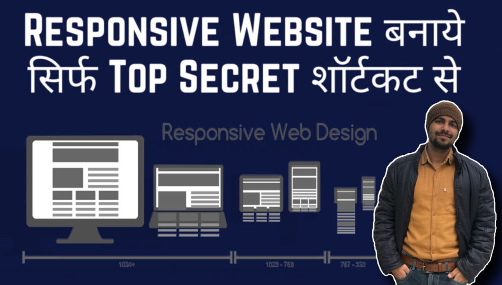
Top Secret to Build Responsive Web Design in 30 minutes 👍!! Website Hacks🙄 (Hindi) Did you check video on youtube? You can easily make your responsive web design with media queries code. Hope you would like this website, lets understand step by step.
What is Responsive Design
When we open any webpage in different devices like – mobile, tab, laptop and desktop, then the design opens correctly in all the screens, we call it responsive design. For this, first we have to add link inside the tag in the html which helps in making the website responsive.

Responsive Web Design
Responsive design means to make any design for all sizes, that is, when opened in any size, it looks correct, for complete information, what is responsive design, you can read from here.
To learn media query, first of all we should have knowledge of Html and CSS, after which we can learn media query for all devices, we use media query for 4 size.
Responsive Device Screen Size List
For Mobile (320px by 551px)
For Tab (552px by 1024px)
For Laptop (1280px by 1440px)
For Desktop (for screens larger than 1441px)
media query min and max width – CSS media query min and max
CSS media query for mobile
Whatever mobile we use, everyone’s size is different, the smallest size of mobile is 320px and the maximum size is up to 551px. That’s why we can write media query for all the mobiles simultaneously in CSS. In which we use min-width 320px and max-width 551px like –
Use this code to make responsive website
@media only screen and (min-width: 320px) and (max-width: 551px)@media means used for all mobiles, iphones and android. only screen means only for mobile size i.e. media query for alll mobile screen size device only.
Suppose we are making design in laptop or desktop and css is written in h1 tag and its font-size: 30px; Have given. If we open this webpage in mobile then its font-size will look very big, to reduce the font size in mobile we will write media query –
In this, apart from font, we can change the things like image size, box-size, color, background-color, border, margin, padding, position etc. for mobile size if you do not write any media query which is written in your CSS. size will be applicable.
Responsive web design For Tablet –
Whatever table we use, everyone’s size is different, normally we write media query for 3 types of size ipad min, ipad and ipad pro size, whose size ranges from 768px to 1024px i.e. tablet this size In which we write CSS of the same size for all, which will reduce only for tabs.
Above we have used font-size: 30px; in CSS. and color: black; font-size: 22px; and color: grey; After which we will see different size and color in both. For more information, you can learn about media query by going to w3school.
Media query for laptop and desktop
Nowadays every office, home and every person has his own personal laptop and every laptop belongs to different company whose size is big and small like – Dell, Lenovo, Mackbook, Hp etc. Laptops of size from 1280px to 1440px. Here too we write a media query for laptops of all sizes.
Here in CSS we have set font-size of h1: 30px; and background-color: white; But if we see it in laptop, then only media query with laptop will work there.
Media query for desktop and Mobiles :-
After writing media query for all sizes, we write media query for desktop and for bigger size, whatever the size of desktop can be, it can be at least 1024px or any size but keep bigger size according to screen. Like if someone has a desktop of 1600px, then we will keep the max-width 1600px like –
But if we do not know the size of the desktop, we will keep only its min-width, after which no matter how big the size is, the same thing will work as you have written your media query, in this way we can write media query of any size. Like if we have to correct the design between 500px to 700px, then we can write by giving min and max width like –
Conclusion
Now you must have come to know completely what is CSS media query, how to write media query for mobile, tab, laptop and desktop, what is min-width and max-width, how can we set mobile view and other size on our computer. You can see, I hope you have liked this post, if you have any question related to responsive, you can ask in the comment box below.


